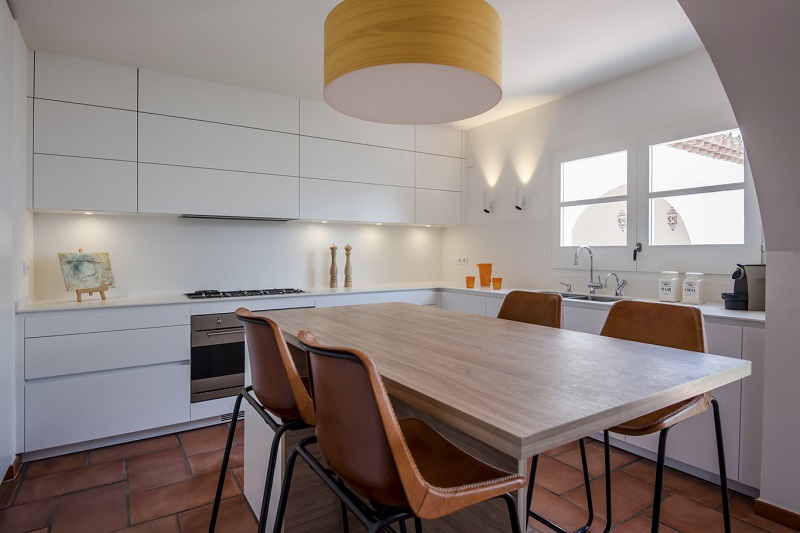
If you are thinking that arc that you have between the room and the kitchen it is very outdated and must be changed, still there! It turns out that the arches are ideal for connecting spaces, but in recent years we have not valued in perspective. We can see an excellent example in this house where Clysa has achieved a marked Mediterranean cuisine spirit respecting the original architecture and building materials.
The kitchen opens directly into a living through that arch supported on two pillars that without impeding vision, serves to define work areas and office. Its natural light, driven by the windows and a glass door opening onto a terrace, is enhanced regardless of partitions and applying a color palette dominated by white.

For kitchen furniture we chose the LINE-E Santos model seff White finish, modern design, minimalist profile and straight lines, with their smooth, handleless fronts integrates naturally into the architecture of the housing, offering maximum performance in minimum space.
In contrast the warm touch is provided by the laminated worktop clear Olmo of the island, the lamp with natural wood veneer and ceramic floor pavement, which extends throughout the plant to confer uniformity to the environment. Integration solutions provided by the chosen furniture help everything is always in place, collected and out of view, a key aspect in open kitchens.

Starting from a central island that functions as a work area and office desk, Clysa distributed furniture U – shaped kitchen along three walls. Thus, perpendicular to the island a composite of three base units that make up the cooking area, supplemented by a linear four tall cabinets are available. Forming an L with the above, a second composition of base units scouring the area hosts, in front of the window to take advantage of natural light.
You may also like to read another article on RealOrigin: Combinations of colors and materials for the kitchen
Across the island, an area of four columns compactly integrated and organized appliances, pantry and storage spaces. With this distribution is achieved a fully equipped kitchen where everything is within walking distance, so reducing unnecessary travel when working. Finally the furniture from roof of tall cabinets and columns can earn additional storage areas, removing most of the available space.

As if this kitchen you liked as much as me, I tell you that besides furniture Santos has faucet, sink and soap dispenser White; dishwasher Miele; hob, oven and microwave Smeg; fridge and freezer Liebherr hood and Pando … A bit of everything.
It also highlights the lighting in the project, especially the lamp LZF suspension and wall light Faro. They are small details that add personality to the set and environment that make it much warmer and cozier than it would be if I had not and simply contuse with embedded pockets. It depends on the type of cuisine, but if we choose very smooth and minimalist models details are important to create a sense of home.


