2017 is loaded with color. And as a matter of taste there is no writing, this year is accompanied by chromatic proposals of all kinds. So if you’re thinking about renovating the decor, notes the trends and color combinations winning 2017.
Refreshing, relaxing, sophisticated, feminine and much more. We have colors for all tastes and for all types of stays. So you already know: make room for color!

Blue and green
The experts in decoration and interior design gurus point to the combination of blue and green. Two colors inspired by nature that contribute to relaxing and serene environments.
In any of its versions, these colors convey a sense of calm and well-being. From the sophisticated and powerful navy blue to the serene and refreshing turquoise blue. And with the green the same thing happens: an elegant olive green or a merry green mint.
In any of its versions, both green and blue will be very present in decor throughout this 2017. Do not tell us, but the Pantone Institute that like every year has presented us their favorite proposal for fashion colors.
Yellow and pastel shades
If you are not superstitious, a highly recommended home decorating color is yellow in soft version. A hue that works very well with other pastel colors like pink, green and earth tones.
The advantage of decorating with pastel shades is that these colors convey a sense of calm and well-being. Without giving up the style, these tones in soft version bring freshness to the decoration and put the point different to the environments. Creative scenarios that deviate from the conventions in search of young and trendy interior.

Mineral gray
But if yours is not innovating, decoration experts also point to other, more sober tones for 2017 deeply sophisticated : mineral gray.
Neither the classicism of the black nor the sobriety of the gray tones. This 2017 reveals the mineral gray. An alternative for those who do not want to opt for the eternal black. The mineral gray takes over the decoration and combines with pieces and accessories in full color to create contrasts and textures that fill the interior with life.
You may also like to read another article on RealOrigin: Decoration in blue 7 inspiring ideas for your home fall in love
Beige and green
Serene, warm and earthy. This is one of the colors that are very present during 2017. This is the hazelnut , as he has christened the Pantone Institute. A soft beige inspired by nature to create discrete and bright, but not as elegant as the rest.
The great advantage of this color is that it is versatile and timeless. So it admits a great variety of shades. Although one of the winning combinations for many decoration gurus is beige and green, both in soft version.
These two colors complement each other perfectly. Refreshing and youthful, the green finds in the beige its great ally to achieve interiors more warm and welcoming.

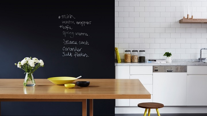
Blue and white
And speaking of nature and relaxation, decoration lovers not forget another favorite duos interior design : the bright white and blue vibrant.
The eternal combination of navy blue and nuclear white is another of the great classics of decoration. The colors inspired by the ocean cool the interiors, while the white brings light to the spaces. The result is a timeless combination that never gets old. What is your favorite color combination for this 2017?